.png)


UX
Case Study
Hangry Mood started as a simple question. What if your mood picked dinner for you. This case study explores how emotion, behavior, and decision fatigue intersect, and how a little structured chaos can turn overwhelm into clarity.

How might we eliminate decision paralysis for users in high-stress, "hangry" states?


The Hangry User:
Targeting busy professionals, students, and any individuals with high-pressure schedules who experience sudden, intense irritability and cognitive decline due to hunger. When blood sugar drops, the ability to process complex information vanishes.

System Failure: "The Paradox of Choice."
Most food apps are built for browsing, not for hunger. When you’re starving, a list of 50 restaurants isn’t a feature; it’s a chore. This "scroll-hole" creates a cycle where the hungrier you get, the harder it is to choose, until you eventually just give up and close the app.


0-30%
31%-70%
71-100%


Personas
Behind every hangry meltdown is a human with context. These personas represent real patterns of stress, energy, and decision tolerance so the app responds to how people actually feel, not how we wish they felt.

Chillin User Sam:
The Casual Student
Rumblin User Paul:
The Tired Creative
Nuclear User Maya:
The EA Gatekeeper
Hungry-ish,
exploring options.
The rumble is real,
time to choosel
How hangry are we feeling?
Hunger pain emergency. Food STAT!


Determined Action:
User needs the app to decide.
-
The app delivers a fast, confident solution.
Discovery Model:
User is open to browsing.
-
The app surfaces appealing options without effort.
Guided Choice:
User needs a nudge.
-
The app narrows options and makes the choice feel obvious.
"I'm not in a rush, just show me something cool."
"I'm hungry, but I can't decide on anything."
"I need a solution in 4 minutes, not a menu."
Explore appealing options without effort or pressure.
Too many similar choices make browsing feel like work instead of fun.
A curated suggestion that feels like a "discovery" rather than a chore.
Get food fast and feel confident it’s the right pick.
Gets stuck comparing options and second-guessing, instead of choosing causing fustration.
Urgency overrides logic, leading to random rushed choices and regretful decisions.
Journey
Maps
Before designing screens, I mapped the emotional rollercoaster of being hungry and indecisive. These journey maps uncover friction, mood shifts, and those critical moments where the right nudge can turn spiraling into solved.

Sam
OBJECTIVE
Find Fun Choices
Shows Slight Hunger
Explores Casually
Narrower Choices
Satisfying Choice
NEED
No Pressure Start
Relaxed Slider
Visual Variety
Gentle Guidance
Choice is Confident
FEELING
BARRIER
Option Overload?
Hunger Level +-?
Mindless Scrolling
Fears Wrong Pick
Post Order Doubt
Sam
Discovery Mode
Relaxed
Curious
Interested
Pleased
Happy

OBJECTIVE
Avoid Overthinking
Shows Hynger Level
See Fewer Options
Get Decision Help
Decide Fast
NEED
Low Effort Start
Urgency Slider
Small Shortlist
Smart Picks
Choice Reassurance
FEELING
BARRIER
Decision Fatigue
Hard to Decide
Choice Overload
Fear Regret
Low Energy
Guided Choice
Paul
Tired
Drained
Overwhelmed
Relieved
Satisfied

Instant Path Foward
High Intensity Hunger
Direct Minimal Steps
Have App Decide
Auto Rec
Irritated
Hangry
Impatient
Relief Incoming
Calm Again
OBJECTIVE
NEED
FEELING
BARRIER
Hates Friction
Zero Thnking
Beoqsing = Delay
Have App Decide
Auto Rec
Get Food Fast
Urgent Hunger
Skip Browsing
Have App Decide
Eat ASAP
Fixed Action
Maya

The Hangry
Logic
We have all been there. Too hungry to think, too indecisive to choose, one scroll away from ordering something random. This flow was designed to prevent that spiral. Instead of asking what do you want, the Hangry App asks how hangry are we feeling. From there, the experience adapts to the user’s emotional bandwidth. The hungrier you are, the less you have to think. The system does the heavy lifting so you do not have to.

These sketches translate the flow into structure. At this stage, the focus is clarity over polish. I mapped how users move from hunger mood to decision, keeping the interface simple and friction-light.
Sketching
the Appetite
1
Sandbox Sketches ~ Handdrawn
Where messy ideas run wild. I explored layout, emotion, and hierarchy before worrying about polish.

2
Pilot Wireframes ~ LoFi
Same ideas, now grounded. Structure, hierarchy, and flow locked in before moving into build mode.

Home — Mood Entry

Chillin — Curated Calm

Rumblin — Fast Decisions
Nuclear — Crisis Mode


Design System
Before pixels turned into screens, the rules came first. This system defines how Hangry feels, moves, and escalates from calm browsing to full emergency mode.
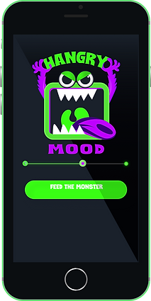


Prototype
The interface adapts to hunger intensity by reducing cognitive load as urgency increases. Each state modifies hierarchy, choice volume, and call-to-action prominence to match the user’s emotional bandwidth.

Meet the Adaptive States


From Mood to Meal


See Hangry Mood in Action

Vibes to
Validation
I ran usability testing to confirm the Nuclear flow was clear, fast, and emotionally satisfying, even when users were hangry and impatient. The goal was simple: make sure the “help me right now” path stays frictionless.

Measuring
Success
If Hangry Mood App doesn’t reduce stress and help users decide fast, nothing else matters. Metrics focus first on speed, confidence, and repeat use, with revenue layered in after value is proven.

Success Criteria: Clear thresholds for launch, iteration, and risk.
It Has
Legs!
How Hangry Mood sustains itself without sacrificing trust.
Hangry Mood is free for users. Revenue is generated through restaurant partnerships that prioritize high-intent placement, not intrusive ads. The model is designed to protect emotional relief while creating sustainable growth.

No Patience
Required
Designing for users with low attention, low energy, and zero tolerance for friction.

When people are hungry, tired, or stressed, their patience and cognitive bandwidth drop quickly. Hangry Mood was designed to work in these low-energy moments by prioritizing clarity, contrast, and simple decision paths. Accessibility wasn’t treated as a checklist but as a design principle, ensuring the experience remains usable, readable, and calm even when users are overwhelmed.
Designing for Zero Patience
Hangry Mood was designed for a moment most apps overlook: when users are hungry, impatient, and mentally drained. In these situations, traditional browsing and decision-making patterns break down. By prioritizing speed, clarity, and emotional reassurance, the experience helps users move from frustration to confident action in under ninety seconds.
Designing this product reinforced an important lesson: great interfaces don’t just organize information, they reduce emotional friction. Every decision in Hangry Mood, from simplified flows to reassuring microcopy, was made to lower cognitive load during high-stress moments. The result is a product that treats urgency and emotion as core design inputs rather than edge cases.
“When people are hungry, clarity beats choice.”